Objective of the project was to
automate, improve and simplify planning and communication to save time. Ultimately,
the goal is to create a tool that makes life easier for every participant in a Community Supported
Agriculture (SoLaWi).
This should increase the number of participants, making the environmentally friendly approach of
'SoLaWi' more accessible to the general public.
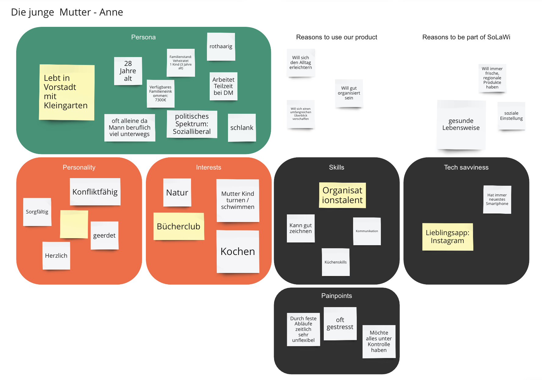
We delineated the target audience through the creation of fictional characters representing
the intended users. These personas were attributed specific characteristics, including
demographic details, personality traits, interests, and abilities, to make them tangible.
'Pain points' and 'Tech savviness' were also considered crucial.
All project decisions are made with a focus on these personas, assisting in the
identification of suitable interviewees. After initial research and interviews with CSA
users,
we identified 4 personas. In the image, you can see the profile of one persona “Anne”.
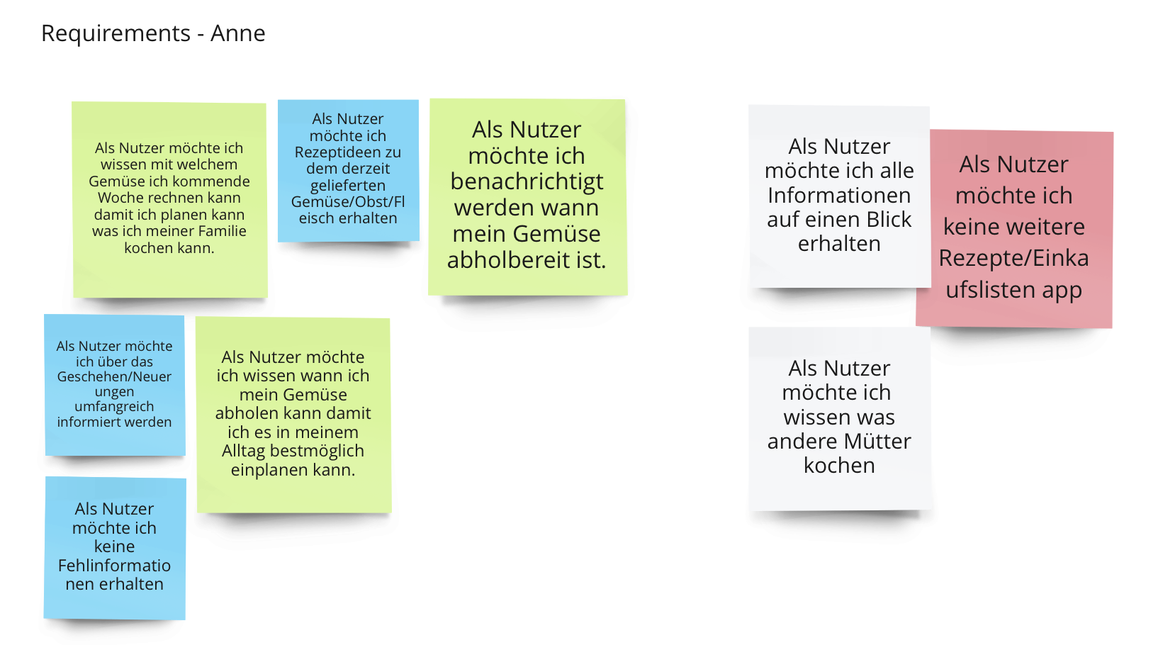
After completing the personas, the next steps involve empathizing with each fictional character, understanding the motivations behind using the app, and determining the reasons leading them to the SoLaWi app. This analysis guides the identification of features that facilitate daily life and potential additional functionalities. The brainstorming process formulates sentences for each persona, starting with 'As a user, I want to...' For instance: 'As a user, I want to receive notifications when my vegetables are ready for pickup.' Once comprehensive user requirements for all personas are gathered, the next step involves aligning and developing specific app features. For example, based on the user requirement mentioned earlier, the app's notification function is created.
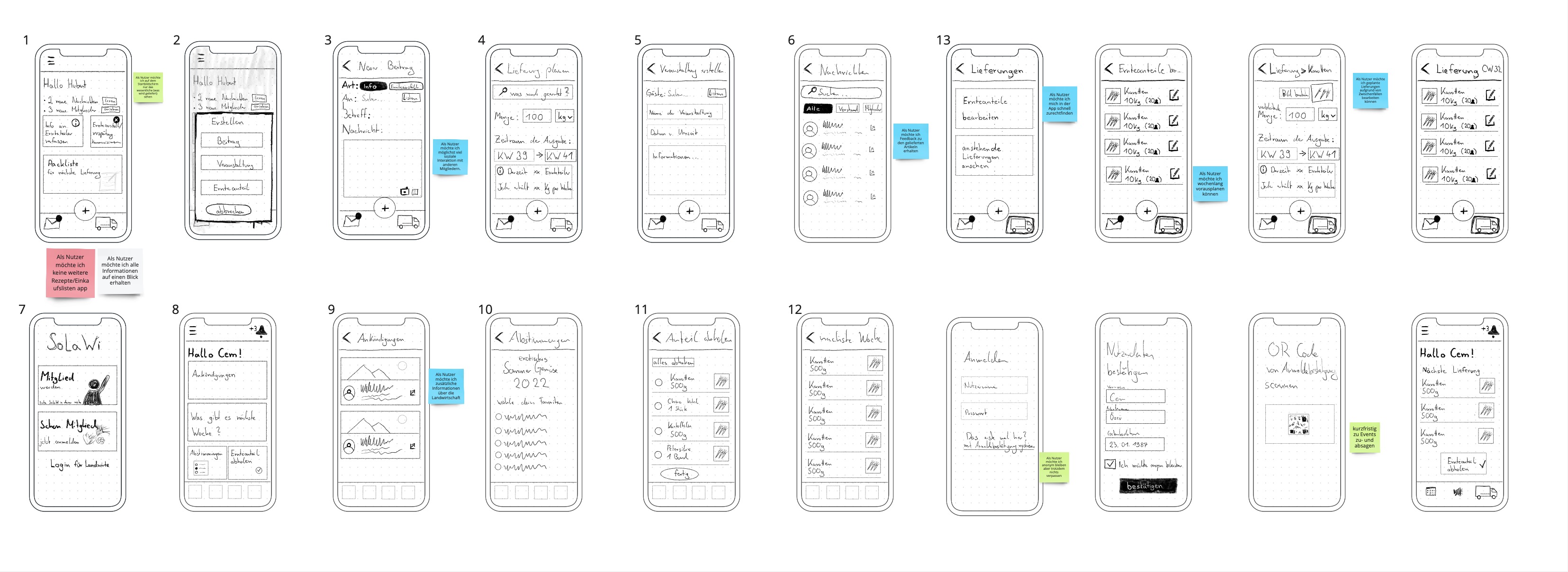
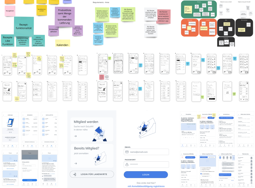
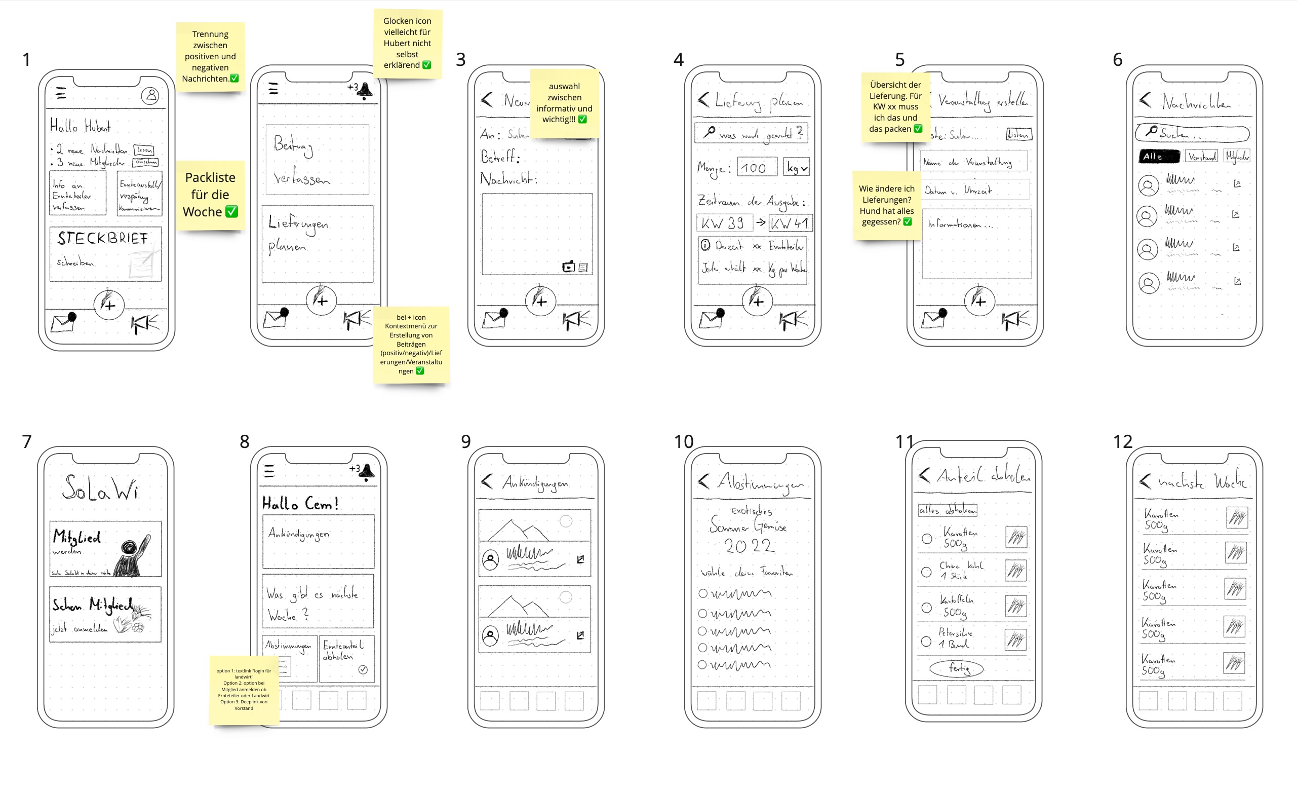
After identifying initial requirements from the personas, rough sketches of individual
functions, also known as scribbles, are created.
Anne, Dieter, Hubert, and Cem (personas) have distinct needs, resulting in tailored user
interface concepts for each user group.
To implement this, the onboarding concept is utilized, allowing users to specify their
preferences and customize the app according to their individual needs.
For the reflection on the prototypes, our project team met virtually. Together, we went through the illustrated functions, attempting to empathize with the personas and reflect on their requirements. Throughout the process, additional characteristics of each persona emerged, leading to the development of further requirements.
Based on the outcome of the reflection, we identified further user stories for all personas. We created a second iteration of scribbles according to those newly identified requirements and user stories.
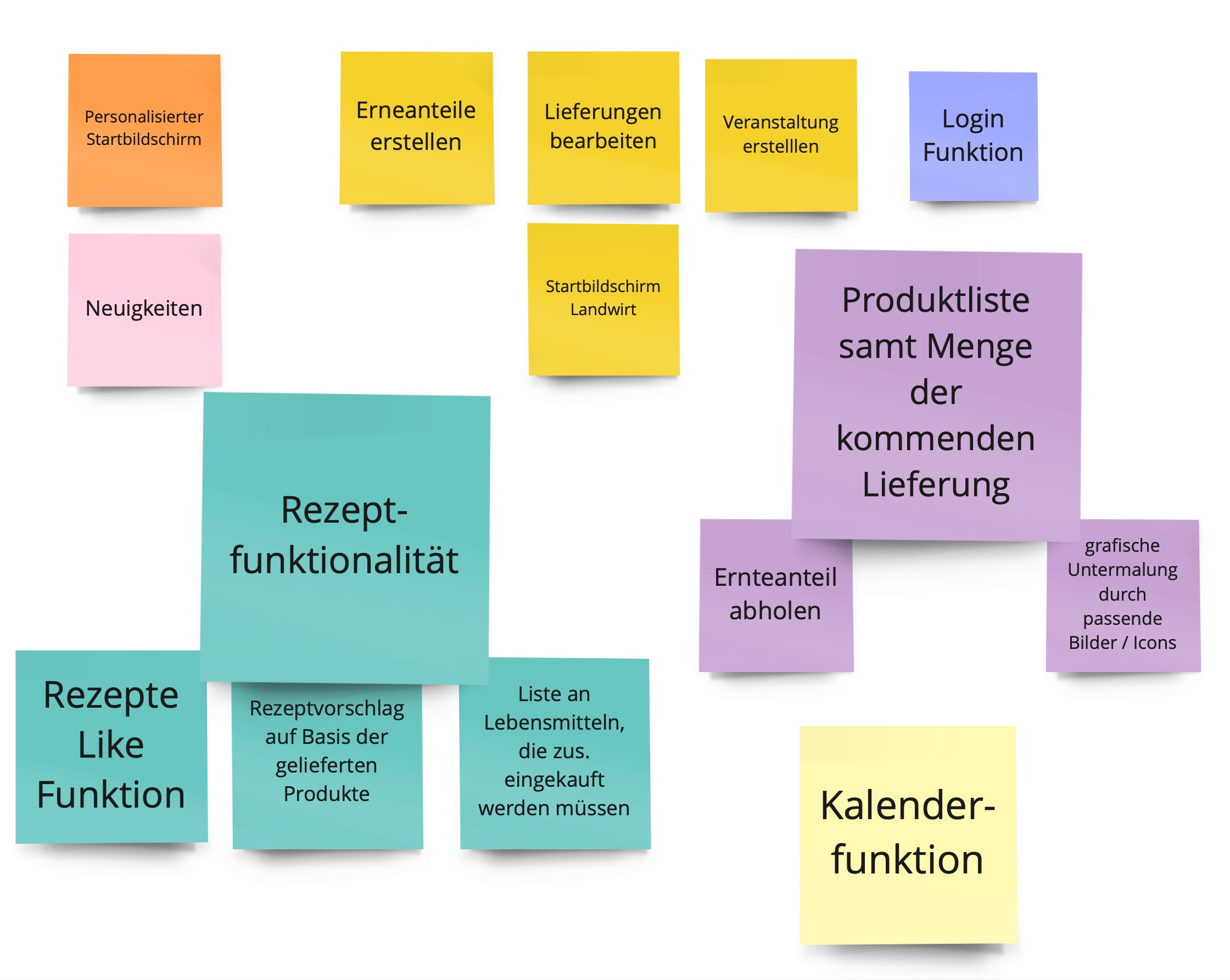
In the sixth step, to focus on the essentials, we documented the core functions. This process also serves as preparation for wireframing in the next step. The listing of core functions is crucial for personalizing the app, as users prioritize these functions during onboarding. The user's start screen aligns with their chosen core functions based on their preferences.
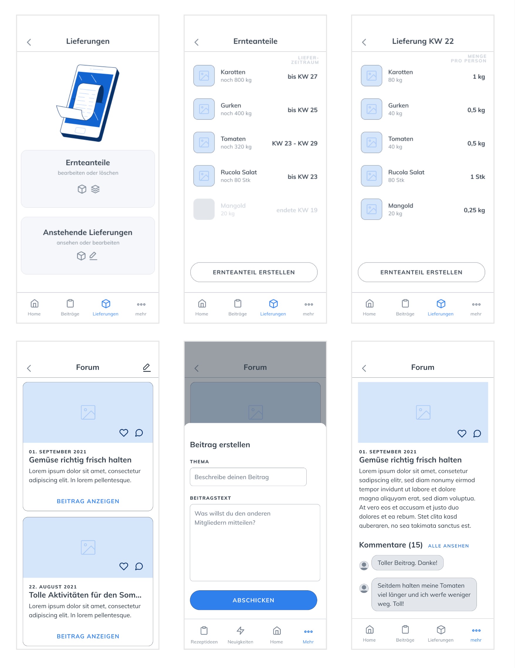
In the seventh step, the adapted scribbles were transformed into wireframes.
Unlike hand-drawn and less precise scribbles, wireframes are created with a higher level of
fidelity.
Significant emphasis is placed on usability and proportions, considering the underlying user
interface, particularly the Touch User Interface (TUI) relevant for this project.
TUI requires larger controls due to the imprecision of finger taps compared to mouse clicks.
Microcopy, the wording of essential UI elements like buttons, links, navigation, and
headings, is crucial for wireframing to ensure understanding by personas.
The wireframes were created using the Figma prototyping tool, incorporating the 'Daresay
Mobile UI Kit' for a variety of pre-designed controls. During the process, some UI elements
from the scribbles, such as the originally planned two-column layout for pickup dates, faced
challenges in the wireframes due to space constraints.
For instance, the 'Add to Calendar' button was too long for a two-column layout. Conversely,
in some cases, there was excess space. Maintaining balance was critical to prevent controls
from moving out of the thumb zone, ensuring optimal usability.
The prototype validation involves open interviews with five end-users and one farmer to
gather insightful feedback. The interview structure and questions remain consistent across
all interviews to ensure a qualified validation of requirements. Due to the current
pandemic, interviews are conducted via phone or Microsoft Teams. Participants receive the
prototype files in advance, including interface designs for end-consumers and the farmer,
illustrating their respective intended buttons.
During the call, an explanation of each button and app function is provided, followed by an
open conversation where participants freely express their opinions, highlighting both
advantages and drawbacks. To maintain coherence, predefined guiding questions are used in
the open discussion.
In summary, the interviews reveal that the app significantly simplifies communication and
various processes within community-supported agriculture. Positive aspects include the app's
user-friendly design, praised for its clear menu and buttons suitable for users of all ages
and technical expertise. The lower menu is particularly appreciated for its clarity. The
feature for creating and providing feedback on events is considered necessary, though a
participant list is suggested as an improvement for organizing rides. Interaction options
are also requested. Criticisms include the absence of portion details in the recipe section
and the app's monotonous graphical design.
Following validation and analysis of feedback, adjustments are made to the prototypes,
focusing on the identified key points. Graphic design changes are not possible as the
prototypes represent initial drafts.
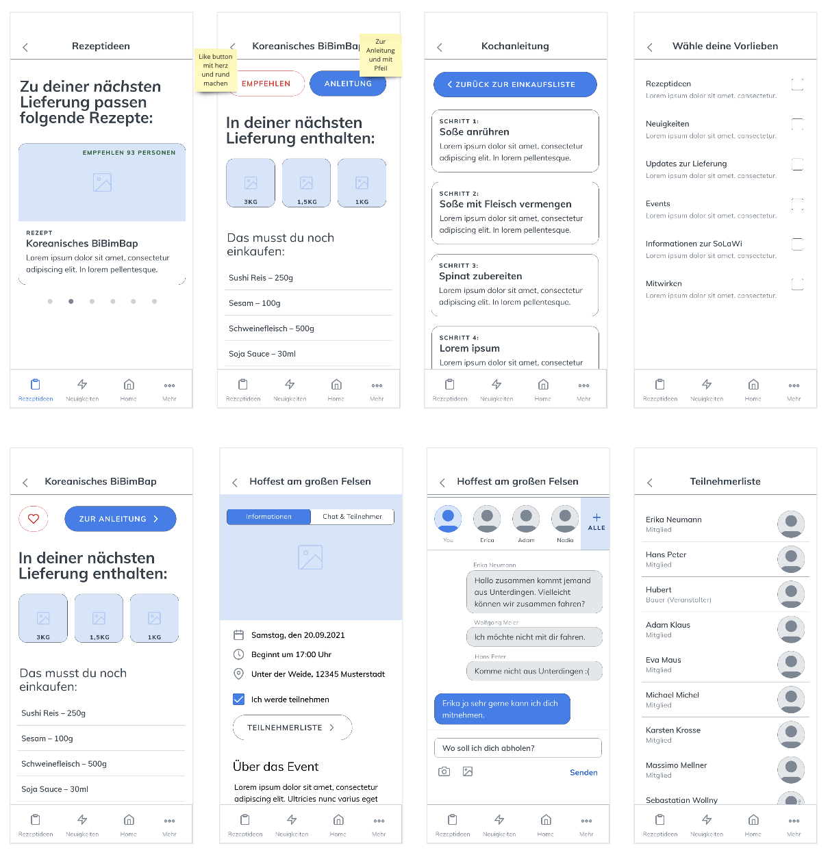
In the ninth and final step, the last feedback was implemented. Users expressed a desire to
form carpools for events and exchange information through the app. Consequently, a chat
function is integrated into the event screen alongside the participant list. A tab element
allows users to switch between information and the new features of chat and participant
list. The chat function resembles a messenger, enabling all users to participate in the
conversation. The participant list is also made available under the information section,
accessible through the 'Participant List' button placed below the checkbox.
Interviews revealed a user desire for more interaction and communication options. In
response, a forum function is implemented, allowing users to create posts and interact
within posts by commenting. All forum posts can be accessed through the fourth navigation
point, 'More.' Users now have enhanced opportunities for interaction and communication
within the app.